Get a counselling call
Digital Marketing Poster: Design Ideas, Elements and How to Create One in 2026
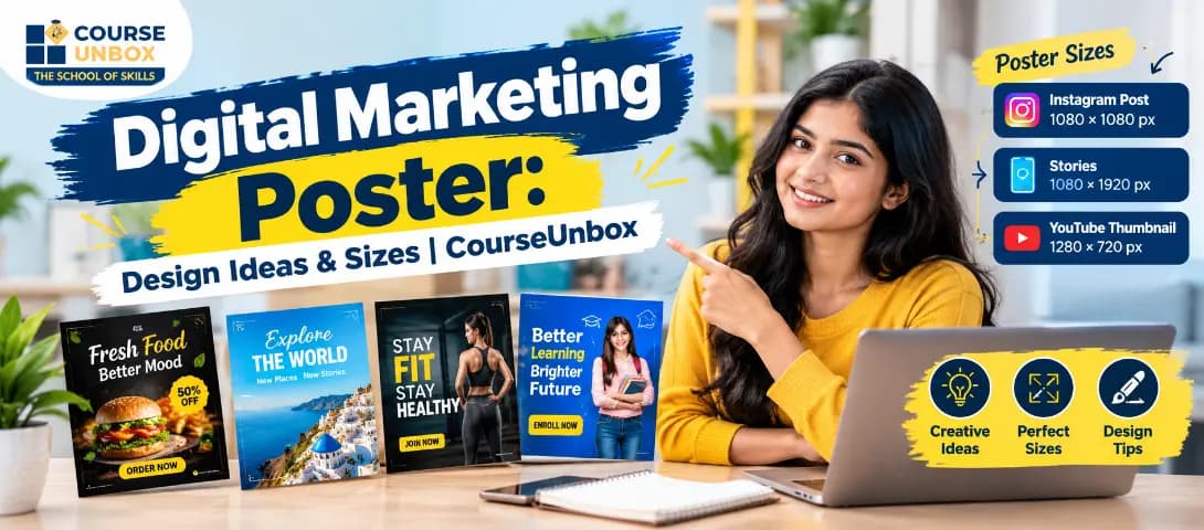
A digital marketing poster is a single visual graphic built to promote a product, service, offer or event across digital channels such as social media, ads and WhatsApp. Unlike a print poster, it is designed for a screen, built around one clear call to action, and its performance can be measured by views and clicks. This guide covers the elements that convert, the right sizes for every platform, design ideas, tools, AI and a step by step process to create one.
A great digital marketing poster can stop a scroll, explain an offer and win a click in under three seconds. Whether you are promoting a webinar, a sale, an agency service or a new product, the poster is often the first thing a potential customer sees of your brand. Yet most guides online teach you how to design a generic print poster for a bus stop, not a poster built to perform on Instagram, Facebook, WhatsApp and paid ads.
This guide fixes that. It explains exactly what a digital marketing poster is, the elements that make one convert, the right sizes for every platform, a step by step design process, real design ideas, the best tools including AI, and the mistakes that quietly kill results. By the end you will be able to design a digital marketing poster that actually drives action, not just one that looks nice.
What is a digital marketing poster?
A digital marketing poster is a single visual graphic created to promote a product, service, offer or event across digital channels such as social media, websites, email and paid ads. Unlike a print poster meant for a wall, a digital marketing poster is designed for a screen, optimised for a specific platform size, and built around one clear action you want the viewer to take, such as clicking a link, saving a date or sending a message.
In simple terms, it is the digital version of the classic advertising poster, but smarter. It can carry a clickable call to action, a QR code, a trackable link and social handles, and its performance can be measured down to each view and click. That measurability is what separates a digital marketing poster from a traditional one.
Why digital marketing posters matter in 2026
Attention online is scarce and expensive. On a crowded feed, a viewer decides in a moment whether to stop or scroll past. A well designed poster is one of the cheapest and fastest ways to earn that moment, communicate a single idea and move someone one step closer to buying.
Digital marketing posters matter for three reasons. First, speed. A poster communicates an offer far faster than a paragraph of text, which suits the way people skim feeds. Second, reach. The same poster can be resized and reused across Instagram, Facebook, WhatsApp, LinkedIn and paid campaigns, giving you maximum value from one design. Third, cost. A single strong poster can run an entire promotion without the expense of video production or a photoshoot.
For marketers and business owners, learning to create these posters is now a core skill. If you want to build it properly, the Content Creation Course Online covers design thinking, visual hierarchy and the tools used to produce scroll stopping graphics.
Digital marketing poster vs print poster
Many people design a digital poster the same way they would a print one, and then wonder why it underperforms. The two are built for different worlds. The table below shows the key differences.
Aspect | Print poster | Digital marketing poster |
Viewing distance | From a few feet away | On a small screen, held in hand |
Primary goal | Awareness | A measurable action, such as a click or message |
Call to action | A phone number or address | A clickable link, QR code or swipe up |
Size | Fixed paper sizes like A4 or A3 | Platform specific pixel sizes |
Text amount | Can hold more detail | Minimal, because screens reward simplicity |
Performance | Hard to measure | Tracked by views, clicks and conversions |
The lesson is simple. A digital marketing poster must be cleaner, bolder and more action focused than a print poster, because it competes inside a fast moving feed rather than on a quiet wall.
The key elements of a high converting digital marketing poster
A poster that converts is not about decoration. It is about getting a few essential elements right. Miss one of these and the poster looks good but fails to drive action.
A single clear headline
The headline is the first thing the eye lands on, so it must carry the main message alone. Keep it short, specific and benefit led. A viewer should understand the offer from the headline even if they read nothing else.
One strong value proposition
Below the headline, state the one reason someone should care. What do they get, and why now. Resist the urge to list every feature. One sharp promise beats five weak ones.
A focal visual
Every poster needs one dominant image, illustration or graphic that draws the eye and sets the mood. A cluttered poster with competing visuals confuses the viewer. One clear focal point guides them.
A visible offer or hook
If there is a discount, a free trial, a bonus or a deadline, make it impossible to miss. The offer is often the real reason a viewer stops, so give it weight and contrast.
A clear call to action
The call to action tells the viewer exactly what to do next, such as book now, message us, register free or shop today. On digital posters this pairs with a clickable link, a swipe up or a QR code. Without a clear call to action, even a beautiful poster leaves the viewer unsure what to do.
Branding and contact
Your logo, brand colours and a way to reach you must be present but not overwhelming. Add social handles, a website or a QR code so an interested viewer can act immediately. A QR code is especially powerful because it turns a static poster into a direct doorway to your page.
When these elements work together, every part of the poster pushes toward one action. That discipline is what makes a digital marketing poster different from simple graphic design.
Types of digital marketing posters
Not every poster has the same job. Knowing the type you are making keeps the message focused. Here are the most common types used by marketers and agencies.
A service promotion poster sells a specific service, such as SEO, social media management or web design. An offer or sale poster pushes a time limited discount and leans heavily on urgency. An event or webinar poster drives registrations for a live session, so the date, time and registration link dominate. A product launch poster introduces something new and focuses on the key benefit and launch date.
A digital marketing advertising poster is built specifically to run as a paid ad, so it must respect platform rules on text and format while staying bold enough to stop the scroll. A digital marketing ads poster for performance campaigns often tests several versions of the same message to find the one that converts best. Finally, an agency or personal brand poster builds authority by showcasing results, testimonials or a clear offer. If running paid campaigns is your goal, the Performance Marketing Course Online shows how to turn these ad posters into profitable campaigns.
Design principles that make a poster work
Good posters follow a few timeless design rules. You do not need to be a trained designer to apply them.
Visual hierarchy comes first. The most important element, usually the headline or offer, should be the largest and boldest, with everything else sized in order of importance. Contrast makes the key message pop, so pair a strong colour against a calm background and never let text blend into the image. Colour sets the mood and should match your brand, with one or two accent colours used for the call to action.
Typography carries more weight than most beginners expect. Use one or two fonts at most, keep them legible on a small screen, and make the headline clearly larger than the body text. Whitespace, the empty space around elements, is not wasted space. It gives the design room to breathe and makes the message easier to absorb. Finally, consistency across your posters builds recognition, so keep the same colours, fonts and style so your brand becomes familiar at a glance.
Digital marketing poster sizes for every platform
A common mistake is designing one poster and forcing it onto every platform. Each channel has its own ideal dimensions, and using the wrong size means your poster gets cropped or looks unprofessional. Use the sizes below as a starting point and confirm current platform specifications before publishing, since platforms update them from time to time.
Platform and placement | Recommended size in pixels |
Instagram feed post (square) | 1080 by 1080 |
Instagram or Facebook story | 1080 by 1920 |
Facebook feed post | 1200 by 1200 |
LinkedIn feed post | 1200 by 1200 |
WhatsApp status | 1080 by 1920 |
YouTube thumbnail | 1280 by 720 |
Print handout (A4) | 2480 by 3508 |
A smart workflow is to design the main square version first, then adapt it to the vertical story and other sizes. Designing for mobile first is wise, because the majority of your audience will see the poster on a phone.
How to design a digital marketing poster step by step
You do not need expensive software or a design degree to create a professional poster. Follow this process and you will produce something effective every time.
Start with the goal. Decide the one action you want the viewer to take before you open any tool. Everything on the poster should serve that single goal. Next, write the copy first. Draft the headline, the value proposition and the call to action before you think about visuals, because the words decide the design, not the other way around.
Then choose the size for your main platform, so you design within the right frame from the start. Pick a template or a clean layout, place your focal visual, and build the visual hierarchy so the headline and offer dominate. Add your branding, a contact method and a QR code or link. Keep refining by removing anything that does not help the viewer take action. Less is almost always more.
Finally, test before you publish. View the poster at a small size on a phone to check that the headline is readable and the call to action is clear. If the message does not land in three seconds on a small screen, simplify it further.
Poster copywriting: how to write words that convert
The visual stops the scroll, but the words win the click. Copywriting is the most undervalued skill in poster design, and getting it right often matters more than the graphics. Start with the headline, because it does most of the work. A strong headline is short, specific and speaks to a benefit the viewer wants. Compare a vague line like quality services with a sharp one like double your leads in 30 days. The second works because it promises a clear result.
Write for the reader, not for yourself. Use the word you more than the word we, and focus on what the viewer gains rather than what you do. Numbers and specifics beat vague claims every time, so a line like save 40 percent this week outperforms a line like big discounts inside. Urgency also lifts response, so a real deadline or a limited quantity gives the viewer a reason to act now rather than later.
Finally, make the call to action a verb led instruction that leaves no doubt, such as book your free call, download the guide or message us on WhatsApp. Keep every line tight. On a poster, each extra word competes for attention, so cut anything that does not help the viewer understand the offer or take the next step. Writing this kind of sharp, persuasive copy is a skill you build with practice, and strong content training will speed that up.
Digital marketing poster design ideas
If you are stuck for inspiration, here are proven design ideas that work for digital marketing posters. Use a bold single colour background with one short headline for maximum stopping power. Build the whole poster around a strong offer, such as a large discount number, when urgency is the goal.
Use a clean before and after layout to show a result, which works well for agencies and service providers. Try a minimal poster with lots of whitespace and one sharp line of copy for a premium feel. Feature a real customer testimonial as the hero element to build trust. Use a countdown or a deadline to create urgency for a sale or a webinar. Turn a useful tip or statistic into a value first poster that earns saves and shares even from people who are not ready to buy yet. For inspiration, design communities such as Behance and Pinterest are full of real world poster examples you can learn from.
Digital marketing poster examples by use case
Seeing how the same principles apply to different goals makes them easier to use. Here are common use cases and what to put first on each poster.
For a sale or festival offer, the discount number is the hero. Make it the largest element, add a clear deadline, and keep everything else minimal so the deal cannot be missed. For a webinar or workshop, the date, time and the one promise of what attendees will learn should dominate, with a simple register now call to action and a QR code to the signup page.
For a service business such as an agency, salon or clinic, lead with the single result the customer wants, support it with one proof point or testimonial, and end with a clear way to book. For a product launch, show the product clearly, state the one standout benefit, and give the launch date so interest builds. For a personal brand or coach, a confident headline, a professional photo and one clear offer build authority and invite a message.
Across all of these, the pattern is the same. One goal, one hero element, one call to action. When you keep that discipline, a poster for a small bakery and a poster for a software launch both become effective, because both respect how people actually read a feed. The more posters you create and measure, the sharper your instinct for what works becomes.
Best tools to create a digital marketing poster
The right tool makes design faster and easier. Here are the most popular options for every skill level.
For beginners, Canva is the most popular choice, with thousands of ready made templates, drag and drop editing and correct platform sizes built in. Adobe Express is another strong, beginner friendly option from Adobe with a large template library. For those who want more control, Figma offers professional design power and is widely used by teams.
To keep your posters looking professional, pull fonts from Google Fonts and source high quality visuals from free stock libraries such as Unsplash and Pexels. When your poster is ready, you will often share it on channels like Instagram, so export it at the correct size for each placement.
Using AI to create digital marketing posters
In 2026, artificial intelligence has made poster creation dramatically faster. AI powered design tools can now generate a full poster layout from a simple text description, suggest colour schemes, write headline options and even remove or replace backgrounds in seconds. For a marketer, this means you can produce and test many versions of a poster in the time it once took to make one.
The smart way to use AI is as a starting point and an assistant, not a replacement for judgement. Let AI generate drafts and variations quickly, then apply the design principles and conversion elements in this guide to refine the result. A marketer who understands both design and AI has a real edge. To build that modern skill set, the AI Digital Marketing Course Online teaches how to use AI tools across the whole marketing workflow, from creative to campaigns.
How to measure if your poster is working
The biggest advantage of a digital marketing poster over a print one is that you can measure exactly how it performs, and then improve it. A poster you cannot measure is a poster you cannot improve. Start by deciding the one number that matters for this poster, such as clicks, messages or registrations, and track it from the moment you publish.
A few simple metrics tell you most of what you need. Reach shows how many people saw the poster. The click rate shows how many of those who saw it took action, which reveals whether your offer and call to action are strong enough. Saves and shares tell you whether the content was valuable enough for people to keep or pass on. For paid posters, the cost per result tells you whether the campaign is profitable.
The real power comes from testing. Create two versions of the same poster with one change between them, such as a different headline or a different offer, and show each to a similar audience. The version that earns more action wins, and you keep improving from there. This simple habit of testing and measuring is what separates marketers who guess from marketers who grow. To turn these posters into measurable, profitable campaigns, the Performance Marketing Course Online teaches the full testing and tracking process.
Common mistakes to avoid
Even experienced marketers make these poster mistakes. The first is cramming in too much text. A poster is not a brochure, so one idea per poster is the rule. The second is having no clear call to action, which leaves the viewer admiring the design but doing nothing.
The third mistake is weak contrast, where text sits on a busy image and becomes unreadable on a small screen. The fourth is using the wrong size for the platform, which causes ugly cropping. The fifth is inconsistent branding, where every poster looks different and none builds recognition. The sixth is ignoring mobile, when the majority of viewers are on a phone. Avoid these six and your posters will already outperform most of what people see in their feeds.
Where to get digital marketing poster templates
You do not have to start from a blank canvas. Tools such as Canva and Adobe Express offer large libraries of editable digital marketing poster templates organised by use case, from sales and webinars to service promotions. A template gives you a professional layout and the correct size, so you can simply swap in your headline, offer, visual and branding.
The key is to customise, not copy. Change the colours to match your brand, replace the stock image, rewrite the copy for your offer, and adjust the layout so the poster feels like yours. A template is a head start, not a finished product. Strong Social Media Marketing Course Online training will also show you how to plan a full series of posters that work together across a campaign.
Final thoughts
A digital marketing poster is a small piece of design with a big job. When it combines a single clear message, a strong visual, a visible offer and an obvious call to action, it becomes one of the most efficient tools in your marketing kit. The secret is not fancy design. It is clarity, focus and a relentless pull toward one action.
Start simple, follow the elements and principles in this guide, test your posters on a phone, and improve them based on real results. As you grow, pair your design skill with strategy through CourseUnbox programs such as the Content Creation Course Online and the AI Digital Marketing Course Online, so your posters do not just look good but also drive real business results.
About the Author
Jugal Chauhan
Jugal Chauhan is a digital marketing strategist and tech educator with a passion for making complex topics accessible. He writes about marketing, technology, and professional growth to help learners and businesses thrive in the digital age.
Learn more about us →